Introduction: Why this matters now
For years, we’ve been building products that live at the edge of conversation and interface; blending text, visuals, and logic to make digital interactions feel more human. Now, with OpenAI’s Apps SDK, that edge just got sharper. For the first time, your brand can exist inside ChatGPT; accessible to millions of users where they already spend time. No app downloads. No redirects. Just: “Hey ChatGPT, use [your app] to [perform XYZ].”
It’s the biggest shift in interface design since mobile. Because now, your UI doesn’t wait for users to come to it. It appears in the very moment they express intent.
But with that opportunity comes responsibility. ChatGPT isn’t an app store full of landing pages; it’s a conversation layer. And if your experience breaks that flow or feels like an intrusive plug-in, you’ll lose trust before you earn attention.
We’ve been studying OpenAI’s official design guidelines and adding our own field-tested learnings from years of conversational design work. Here’s our top five: the principles we’d share with any brand looking to design its first ChatGPT app right.
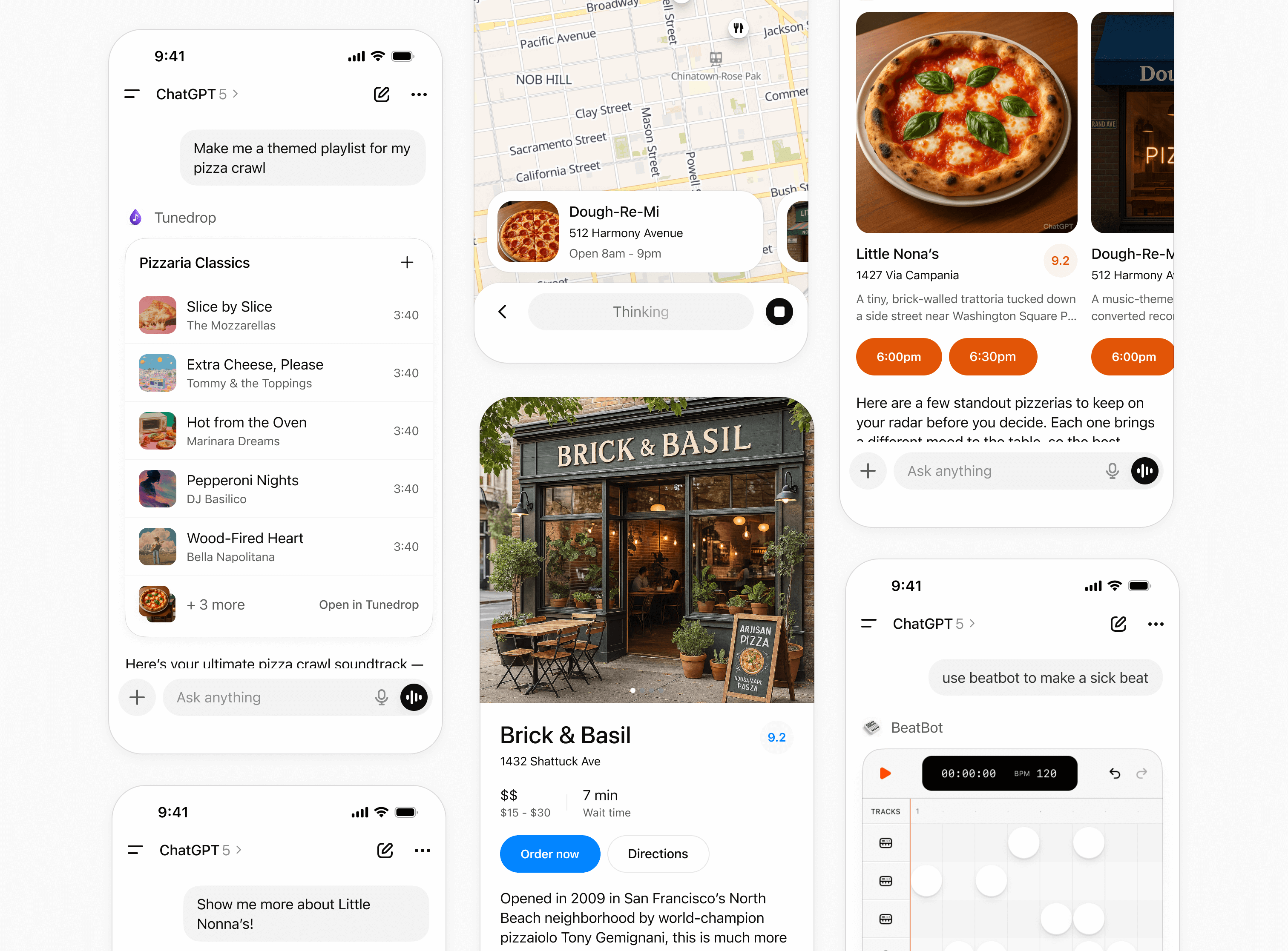
1. Stay conversational: Don’t break the flow
The magic of ChatGPT apps is proximity. Users are already “talking”. Your app should listen and respond, not interrupt.
- Keep your app embedded in the conversation: inline cards, short actions, clear CTAs.
- If you open fullscreen views, make sure ChatGPT’s message composer still works. Users should be able to talk to your app, not tab out of it.
- Avoid “hard stops” (e.g. “click next to continue”). Guide with language, not with buttons.
Nimble Tip: Think in verbs, not nouns. You’re not designing a “dashboard”, you’re designing a “plan a trip” moment, a “summarize a contract” moment, a “compare pricing” moment. That subtle shift in framing keeps your app naturally conversational.
2. Be context-aware: Your users already told you things
If you ask for information they’ve already shared, you break trust and rhythm.
- Use the context ChatGPT passes you. Prefill fields. Remember preferences.
- When in doubt, clarify with plain language: “Would you like me to reuse your last location?”
- Disambiguate gracefully. Guessing wrong feels worse than asking right.
Nimble Tip: Leverage multi-agent orchestration to fetch context silently. An wellbeing agent, a health products agent, and a health services agent can each supply their own micro-context before rendering your app view. It keeps the UI light and the experience smart.
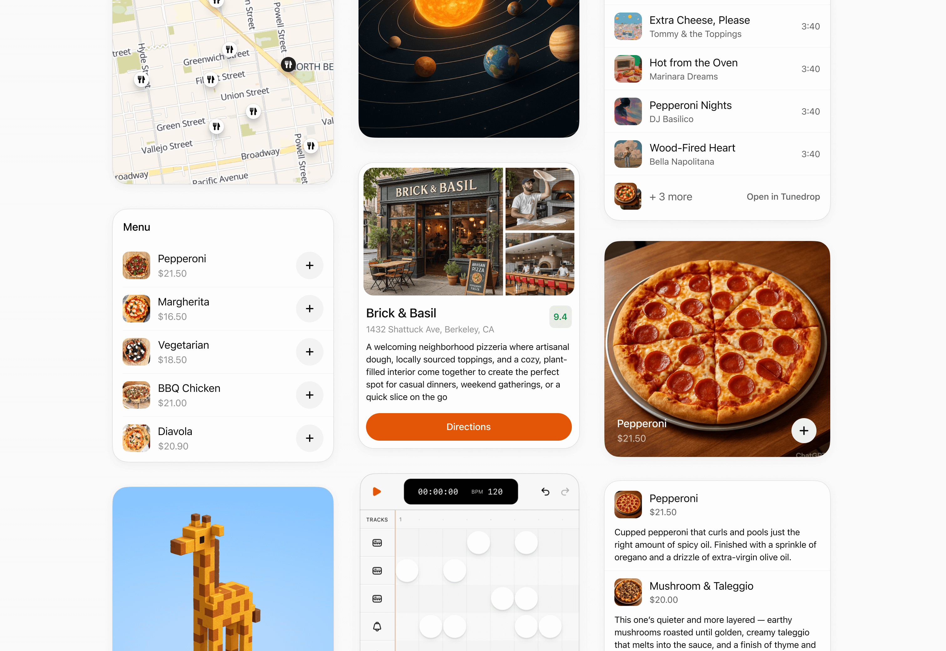
3. Keep it simple: One screen, one purpose
A great ChatGPT app should feel fast and legible, not like a nested workflow.
- Each screen or card = one clear action.
- Use inline components for quick scans (3–8 results max).
- Escalate to fullscreen only for richer detail or complex inputs.
Nimble Tip: If your flow needs more than three screens, consider splitting it into multiple micro-apps or agentic tasks. You’ll improve completion rates and make maintenance easier when the SDK evolves.
4. Design for performance, not perfection
Users expect answers, not loading animations.
- Optimize for sub-second responsiveness. Anything slower than 300ms breaks the “chat illusion.”
- Lazy-load assets and results progressively, especially on mobile.
- Avoid UI reloads. Instead, update inline cards as new data comes in.
Nimble Tip: Use OpenAI’s Evals to track latency and quality across sessions. It’s not just for model benchmarking. It’s a goldmine for UX telemetry. Measure which steps users drop off at, and train your agentic flows to self-correct.
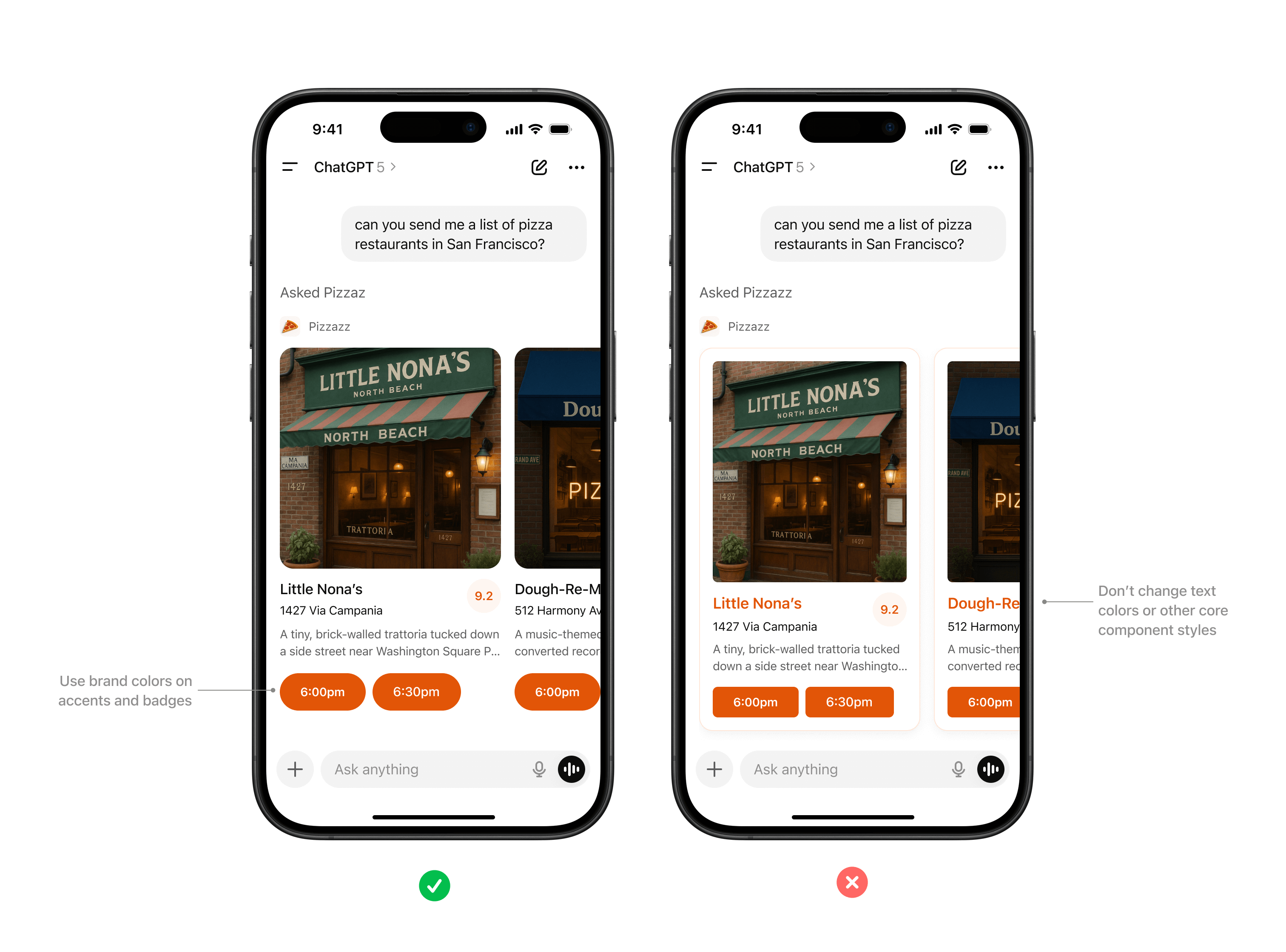
5. Earn trust through familiarity and restraint
You’re entering someone else’s house… act accordingly.
- Match ChatGPT’s native design system: spacing, color hierarchy, font weight.
- Add your brand lightly: a logo, a tone, an accent but never overpower the conversation.
- Be explicit when your app takes action: “I just booked that for you,” not “Done.”
- Never push irrelevant notifications or self-promotion. ChatGPT is a co-working space, not a billboard.
Nimble Tip: The most loved apps will blend utility + personality. Design like a confident guest: helpful, articulate, occasionally witty, but never loud.
Putting it all together
If you zoom out, these five principles really collapse into one idea: design for intent. That’s how we’re approaching it at Nimble: Whether we’re designing a multi-agent HR assistant, a travel app inside ChatGPT, or even our own Nimble Strategy WhatsApp experience. The through-line is the same: simplify the interface until intent becomes interaction. Because in this new era, people won’t just use your app… they’ll talk to it.
Want to build one yourself? We help teams go from idea to working ChatGPT app in just a few weeks through our AI Discovery Track. Find out all about it via nimblestudio.com/ai and start building with us!
